Binscatter
03 Nov 2017This post illustrates use of the Python module binscatter. The Stata package that inspired this module has a far more extensive explanation of what a binned scatter plot is and how to interpret it.
Let’s say we want a visual representation of the relationship between wages and time spent on the job (tenure). People with more tenure have more job experience. We may want to understand how more tenure affects wages either with or without accounting for experience.
Let’s start by making up some data. Note that if we were to regress wages on experience and tenure, the coefficient on tenure would be 1, but if we regress wages on tenure only, the coefficient is greater.
import pandas as pd
import numpy as np
from matplotlib import pyplot as plt
%matplotlib inline
import binscatter
n_obs = 1000
data = pd.DataFrame({'experience': np.random.poisson(4, n_obs) + 1})
data['tenure'] = data['experience'] + np.random.normal(0, 1, n_obs)
data['wage'] = data['experience'] + data['tenure'] + np.random.normal(0, 1, n_obs)
data.head()
| experience | tenure | wage | |
|---|---|---|---|
| 0 | 8 | 7.612358 | 13.711054 |
| 1 | 4 | 3.721119 | 7.987760 |
| 2 | 4 | 3.496378 | 7.608632 |
| 3 | 9 | 8.432021 | 18.218504 |
| 4 | 3 | 2.439553 | 4.583498 |
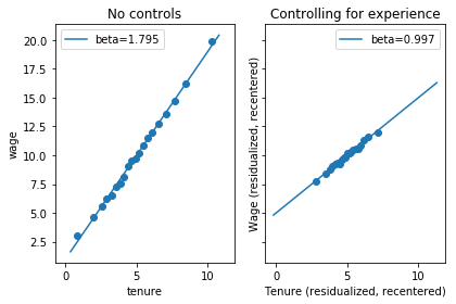
In the first plot, we’ll break observations into twenty bins by their level of tenure. In the second figure, we’ll residualize both wages and tenure using experience, then do a binned scatter plot of residualized wages against residualized tenure.
Why is a residual plot helpful?
Define alpha, beta, and gamma to be best linear predictor coefficients and $E^*$ to be the best linear predictor function.
\[E^*[\mathrm{wage}_i | 1, \mathrm{tenure}_i, \mathrm{experience}_i] = \alpha + \beta * \mathrm{tenure}_i + \gamma * \mathrm{experience}_i\]Let $\tilde{\mathrm{wage}}_i$ and $\tilde{\mathrm{tenure}}_i$ be residuals from regressing wage and tenure on experience. Then
\[E^*[\tilde{\mathrm{wage}}_i | \tilde{\mathrm{tenure}}_i] = \beta * \tilde{\mathrm{tenure}}_i\]A binned scatter plot of $\tilde{\mathrm{wage}}_i$ against $\tilde{\mathrm{tenure}}_i$ has the slope that we are interested in.
fig, axes = plt.subplots(1, 2)
axes[0].binscatter(data['tenure'], data['wage'])
axes[0].legend()
axes[0].set_title('No controls')
axes[1].binscatter(data['tenure'], data['wage'], controls=data['experience'], recenter_y=False)
axes[1].set_xlabel('Tenure (residualized)')
axes[1].set_ylabel('Wage (residualized)')
axes[1].legend()
axes[1].set_title('Controlling for experience')
plt.tight_layout()
plt.show()
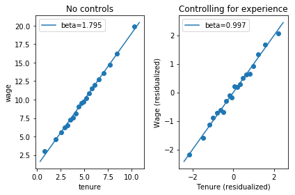
We can also ask, what would the relationship between tenure and wage look like if everyone had the same level of experience? We can make a binned scatter plot that represents
\[E[\mathrm{wage}_i \left| \mathrm{tenure}_i = E^*[\mathrm{tenure}_i | \mathrm{experience}_i = \bar{\mathrm{experience}_i}] + \tilde{\mathrm{tenure}}_i, \mathrm{experience}_i = \bar{\mathrm{experience}_i} \right.],\]by creating a binned scatter plot of $\tilde{\mathrm{wage}}_i + \bar{wage_i}$ against $\tilde{\mathrm{tenure}}_i + \bar{\mathrm{tenure}}_i$.
(The Stata version of binscatter recenters y but not x; the Python version will do the same by default, but has parameters recenter_y and recenter_x.)
fig, axes = plt.subplots(1, 2, sharey=True, sharex=True)
axes[0].binscatter(data['tenure'], data['wage'])
axes[0].legend()
axes[0].set_title('No controls')
axes[1].binscatter(data['tenure'], data['wage'], controls=data['experience'], recenter_y=True, recenter_x=True)
axes[1].set_xlabel('Tenure (residualized, recentered)')
axes[1].set_ylabel('Wage (residualized, recentered)')
axes[1].legend()
axes[1].set_title('Controlling for experience')
plt.tight_layout()
plt.show()